Article
Color Meaning in Advertising: Exploring the Emotional Impact
Did you know that the colors used in advertising can have a significant impact on our emotions and purchasing behavior? Colors can evoke certain feelings and associations, making them a powerful tool for marketers to influence consumer decision-making. Understanding the role of warm colors in advertising is crucial to crafting an effective marketing strategy. In this blog, we will delve into the psychology of color and examine how different colors, including warm colors, can elicit various emotional responses. We will also explore how color meanings vary across cultures and provide tips on testing your color advertising strategy. Plus, we'll answer the age-old question: what is the best color for a call to action? Join us as we explore the fascinating world of color in advertising.
Understanding The Role Of Color In Advertising
Colors in advertising play a significant role in capturing attention and effectively conveying messages to the audience. The right color scheme has the power to evoke emotions and influence consumer behavior, including increasing brand awareness and recognition. Understanding the psychology of color is crucial for creating impactful advertisements that resonate with the target audience and align with the brand identity. By using the right colors, a brand can enhance recognition and create a memorable impression, ultimately shaping consumer perception. The popular color associations and meanings can greatly impact how consumers perceive a brand, leading to increased brand awareness. Color choices can also affect physiological responses such as blood pressure. The role of color in advertising goes beyond aesthetics, influencing emotions and shaping consumer perception, while also increasing brand awareness.
Why Does Color Psychology in Marketing?
Color psychology, a field that explores the impact of colors on human behavior and emotions, plays a significant role in marketing strategies. Marketers understand that different colors can evoke specific responses and associations in consumers. By strategically incorporating color into branding and advertising campaigns, marketers can effectively convey desired brand messages. For example, the color purple is often associated with luxury and sophistication, making it an ideal choice for brands targeting a more affluent or artistic audience. It's crucial to consider cultural differences when using color in marketing to ensure that the intended message is understood universally. By understanding the meanings and associations of colors, marketers can create visually appealing and impactful campaigns that resonate with their target audience. Additionally, they can utilize different color schemes to further enhance the visual appeal and effectiveness of their designs.
Keep color consistent with your branding
When using color in advertising, it's important to keep it consistent with your branding. Choosing colors that align with your brand personality can help establish a strong visual identity in the minds of consumers. Consistency in color usage across all marketing materials - from your website to social media profiles to print ads - can help build brand recognition and trust. It's also important to consider the cultural and emotional associations of colors when selecting them for your branding, as these can vary across different audiences and regions.
Emotional Significance of Different Colors
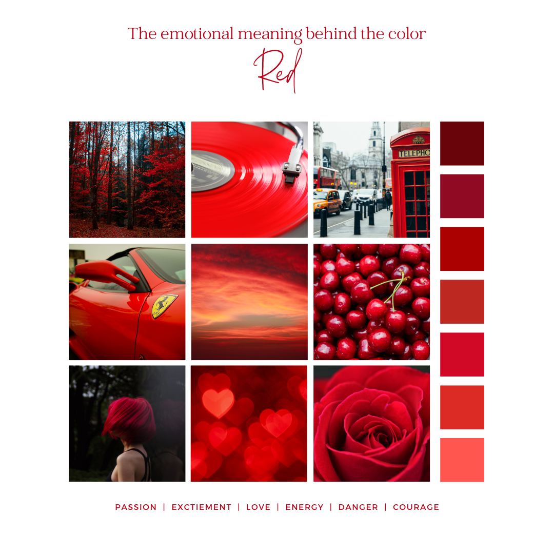
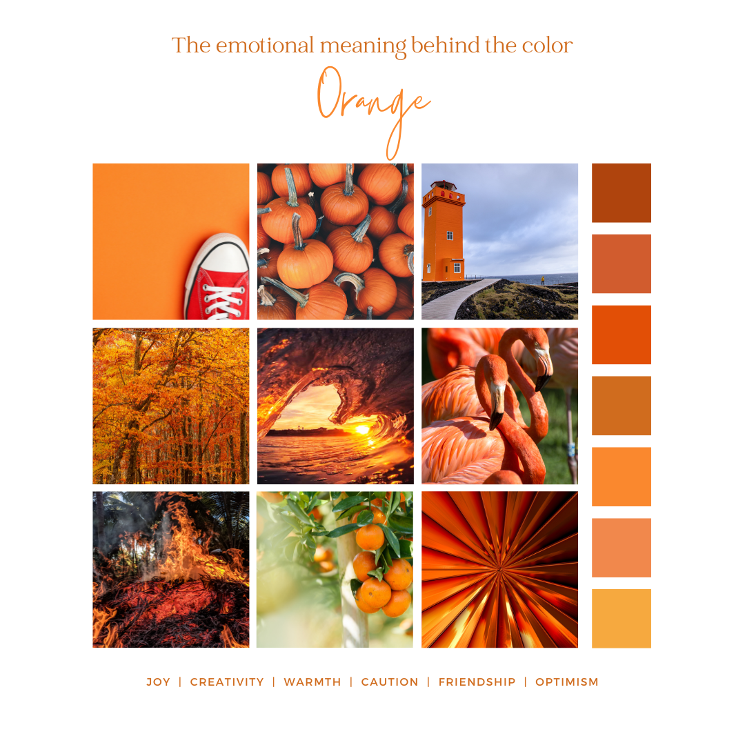
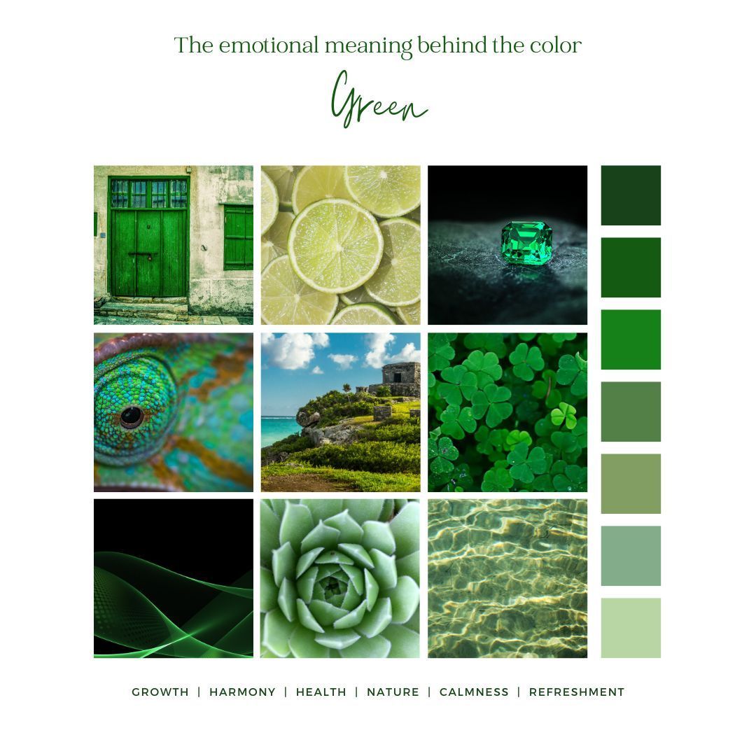
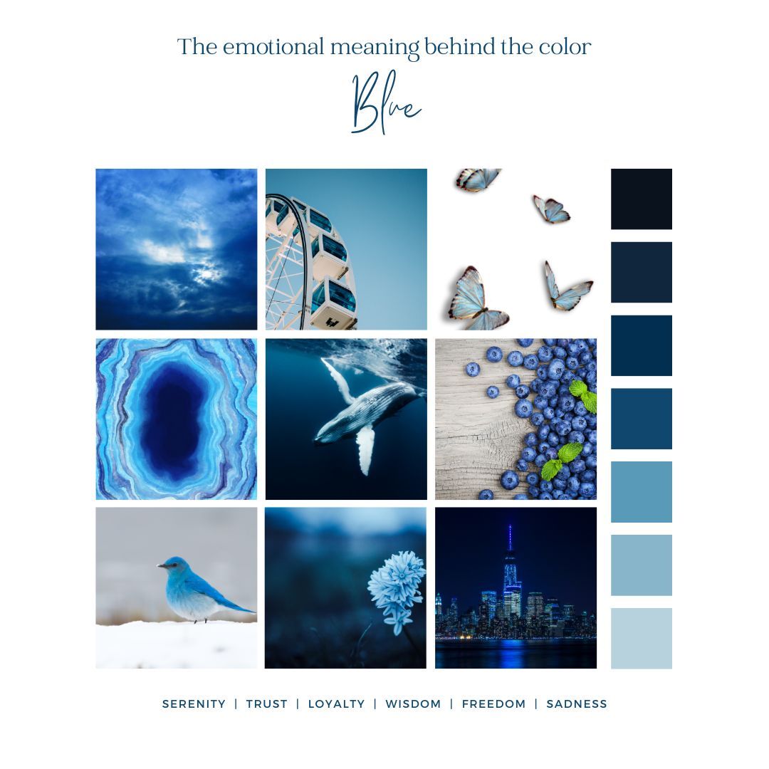
Red stimulates excitement, love, and passion, making it a popular color choice for branding and advertising campaigns targeting a youthful and dynamic audience. Orange, on the other hand, exudes optimism and friendliness, making it a great color for creating enthusiasm and grabbing attention. Yellow represents happiness, confidence, and intellect, making it suitable for brands that want to convey a sense of positivity and affordability. Green, often associated with nature and harmony, is used by brands that want to emphasize their commitment to sustainability and balance. Blue, known for instilling trust and loyalty, is favored by brands that want to establish a sense of dependability and security. By understanding the emotional significance of different colors, advertisers can strategically use color associations to create impactful and memorable brand experiences.
The Stimulating Effect of Red in Advertising
Red is a powerful and popular color choice in advertising for its ability to grab attention and create a sense of urgency. It is commonly used to stimulate appetite in food advertising, making it a great color for brands in the food industry. Red can evoke strong emotions and passion, adding an element of excitement to advertisements. However, it's crucial to use red strategically to avoid negative connotations that can be associated with anger or danger. When used appropriately, red can be a vibrant and compelling color choice that captivates the audience and encourages them to take action.
Orange and Its Energy Boosting Impact
Orange is a popular color in advertising due to its association with joy, creativity and friendship. This vibrant hue, color orange, has the power to create a sense of urgency and excitement, making it an effective choice for grabbing attention. Orange can evoke positive emotions and motivate action, making it a great color for brands that want to inspire their audience. However, it's important to choose the right shade of orange to match the brand message. Just like other colors, orange has its own set of meanings and connotations. Understanding the color associations and using orange strategically can help in creating impactful and engaging advertisements.
Yellow: The Color of Happiness and Caution
Representing happiness, hope, and enthusiasm, yellow is a popular color in advertising. Its bright and vibrant nature grabs attention and creates a sense of confidence, making it a great color choice to evoke feelings of joy and cheerfulness. However, caution must be exercised when using the color yellow as it is also associated with warning signs. The wrong colors or an overwhelming use of yellow can have negative effects on branding and logo design. That being said, when used strategically, yellow can effectively convey friendliness, affordability, and freshness. It brings vibrancy and vigor to advertising campaigns, like sunshine illuminating a room. In terms of readability, yellow is often chosen for its ability to stand out. With its myriad of color associations and spiritual significance, yellow proves to be a versatile and impactful hue in the world of advertising. The color yellow is used by brands such as Ferrari and Ikea, adding a touch of happiness and a carefree lifestyle to their marketing strategies.

Green: Evoking Harmony and Balance
Green, a popular color in advertising, is associated with nature, harmony, and balance. When used in advertisements, it can create a sense of harmony and refreshment, making it ideal for promoting wellness or eco-friendly products. The color green also signifies growth, health, and fertility, making it suitable for brands that want to convey a sense of freshness and vitality. It is important to choose the right shade of green that aligns with the brand's identity and message. By incorporating green into their branding and logo, companies can project an image of friendliness, affordability, and spirituality. Harnessing the power of green can help advertisers resonate with their target audience and evoke positive emotions. That way, when someone sees that product, they’ll immediately know it’s a John Deere. Roots is a fashion retailer. However, when browsing their banner images and marketing materials, you’ll often find their models in natural outdoor settings. The green logo blends well with their nature imagery, helping them attract outdoor enthusiasts as their target market.
Blue: Building Authority and Trust
Blue is a popular color in advertising due to its strong associations with trust, dependability, and professionalism. It has the ability to create a sense of calmness and reliability, making it an ideal choice for brands that want to convey a sense of security and stability. Financial institutions and healthcare providers often use blue in their branding to instill confidence in their audience. However, it's important to choose the right shade of blue that aligns with the brand image, as different shades can evoke different emotions and perceptions. By carefully selecting the appropriate shade of blue, companies can effectively enhance their brand's reputation and build trust with their target audience. Serenity, loyalty, wisdom, freedom, and trust are just some of the feelings your customer may feel about your brand when you integrate the color blue into your branding.
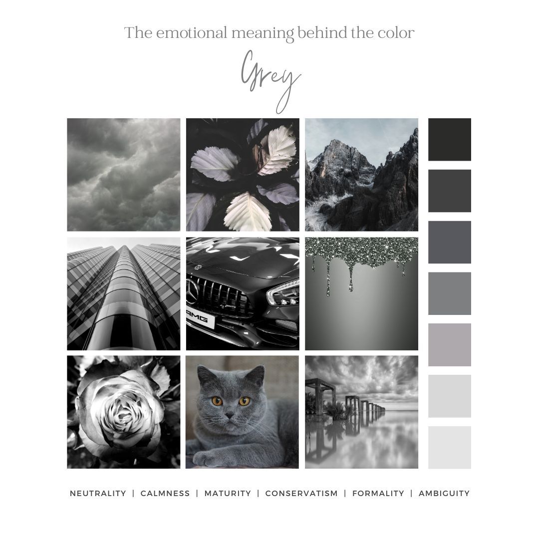
What does grey mean in advertising?
The color grey is often associated with neutrality, maturity, and formality. In advertising, the use of grey can evoke feelings of calmness and stability. It is also commonly used to convey a sense of professionalism or conservatism. However, too much grey in an advertisement may result in a lack of excitement or energy, so it's important to use it sparingly and in combination with other colors for maximum impact. Grey can also be used to create contrast and draw attention to other elements in an advertisement.
How Color Meanings Vary Across Cultures
Colors can have different meanings and associations across cultures, impacting the perception of color in advertising. Cultural context plays a crucial role in global marketing campaigns, where color choices must be adapted to match cultural preferences for enhanced brand communication. In various cultures, different colors symbolize different emotions and concepts. For example, in Japan, the color yellow is associated with courage. It's essential for marketers to consider these variations to avoid using wrong colors that may convey unintended messages. By understanding the popular color associations in different cultures, marketers can create effective branding strategies and logos that resonate with their target audience.
The Dual Nature of Black and White Across Cultures
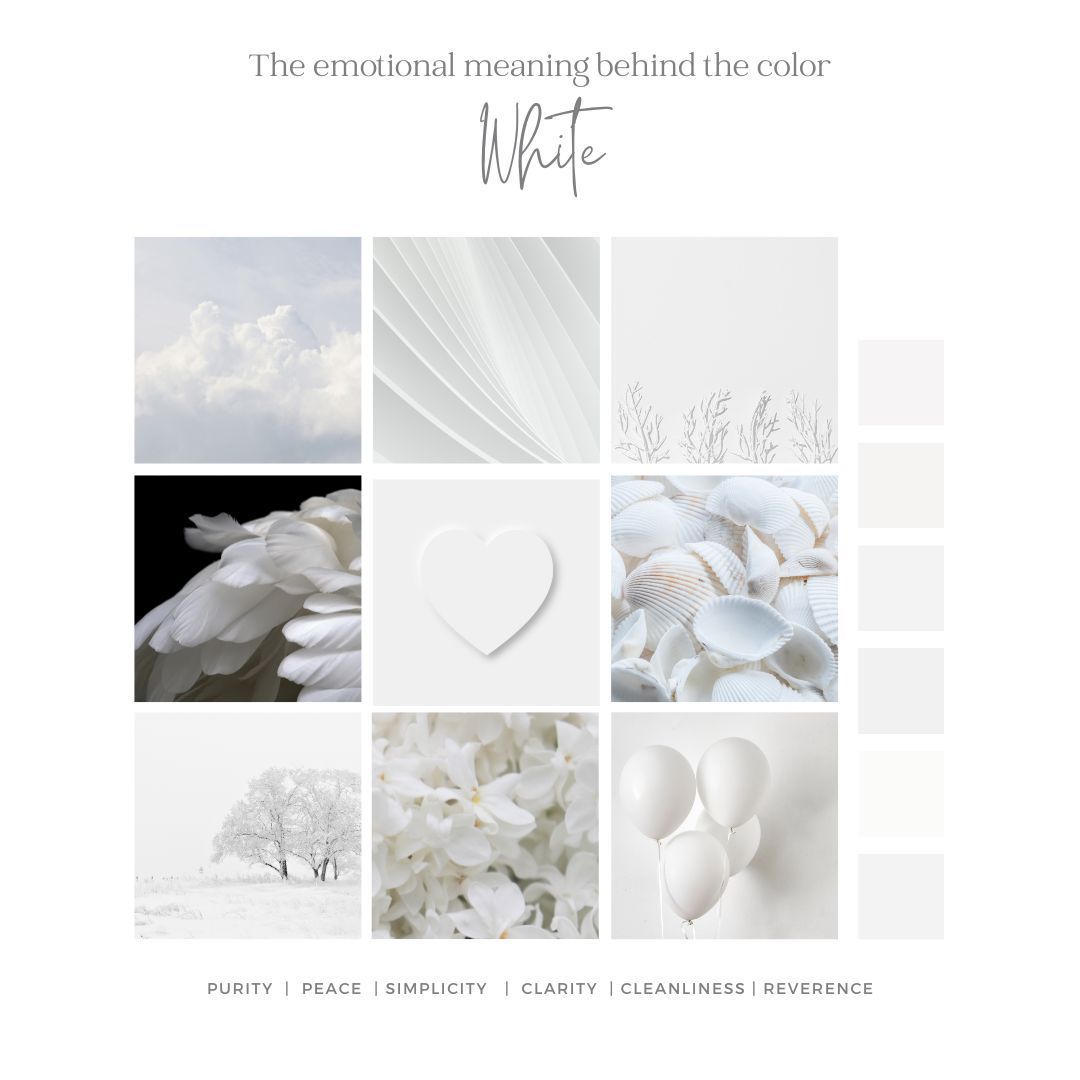
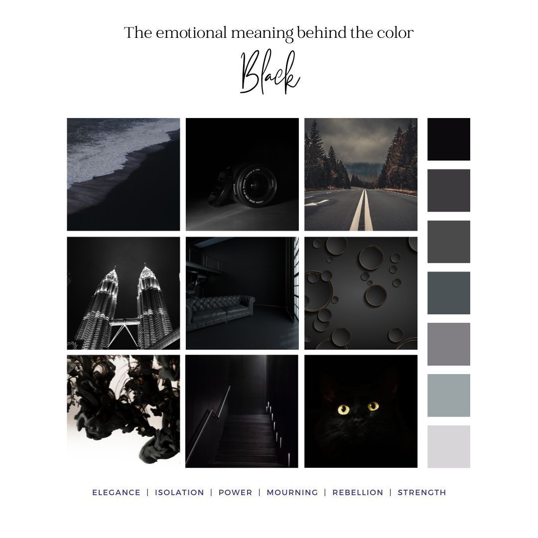
Black and white, two contrasting colors that have a dual nature across cultures. In the world of advertising, black is often associated with elegance, power, and strength. However, it's important to note that in some cultures, black is also linked to mourning and sadness. On the other hand, white represents purity, cleanliness, and innocence. Yet again, cultural differences come into play as white can also be associated with death and mourning in certain societies. It's fascinating how the perception of black and white can vary greatly across different cultures. Understanding these color associations is essential for effective global marketing campaigns that aim to evoke a sense of goodness and purity in their target audience.
PERCEPTION OF PURPLE, PINK, AND BROWN IN VARIOUS SOCIETIES
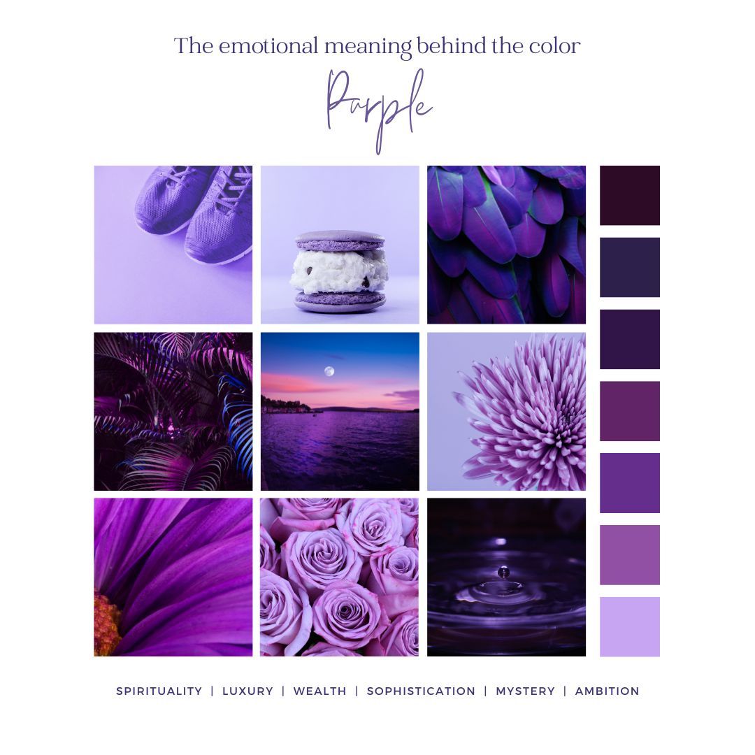
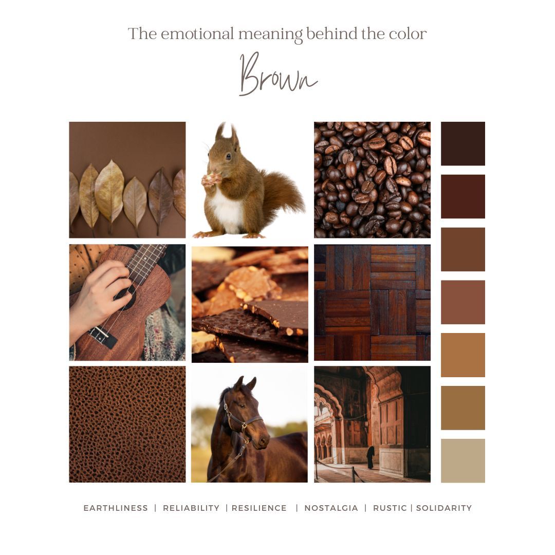
Different societies have diverse perceptions when it comes to the colors purple, pink, and brown. In many cultures, purple is associated with luxury and royalty, conveying a sense of prestige and status. On the other hand, pink is often linked to femininity and playfulness, appealing to a female audience and evoking a sense of joy, innocence, and immaturity. Brown, in various societies, can evoke feelings of reliability and resilience, representing earthiness and stability. Understanding these cultural variations in color perception is crucial for effective advertising campaigns. By leveraging the popular color associations in different societies, brands can create impactful visuals that resonate with their target audience and effectively convey their desired message.
How to Test Your Color Advertising Strategy?
Testing your color advertising strategy is crucial for maximizing its impact. By conducting A/B testing and analyzing the response of your target audience to different colors, you can refine your strategy. Use color psychology principles to guide your testing process and continuously monitor and evaluate the results.
What Is the Best Color for a Call to Action?
The ideal color for a call to action, also known as a CTA, depends on your target audience and desired response. Warm hues like red and orange can create urgency, while blue evokes trust. Contrast between the CTA and surrounding elements is essential, and testing different colors can help identify the most effective choice. The best colors for your CTA can vary, and while red is often used successfully, it's not the only color choice for a CTA button. It's important to consider other options and choose the color that best suits your specific goals and audience.
Does the Use of Color Amplify Your Marketing Message?
Using color in your marketing can greatly enhance your message and create a strong emotional connection with your target audience. It increases brand recognition and influences consumers' purchasing decisions. Incorporating colors strategically in your marketing materials makes your message more memorable and shapes customers' opinions of websites and products. If you don't already have a brand color palette, it's time to make one to keep the colors in your marketing consistent and avoid looking spammy. A color palette allows for some variety while setting standards for your brand's visual identity.
Interesting Facts about the impact of color
- Up to 90% of an initial impression comes from color
- According to surveys, almost 75 percent of pre-adolescent children prefer purple to all other colors.
- Although this might sound like magic, there’s data to support it. 85 percent of consumers cite color as the primary reason for choosing which products to buy.
- In fact, 29% of people rank orange as their least favorite color.
- According to color psychology researchers, 42 percent of consumers form their opinions of websites based on the sites’ designs, with color contributing more to their opinions than any other factor.
Understanding the role of color in advertising is crucial for creating impactful and successful marketing campaigns. Different colors evoke various emotions and associations in consumers, and by strategically using color in your advertisements, you can elicit the desired emotional response from your target audience. It's important to consider color psychology and cultural differences when selecting colors for your ads, as meanings can vary across societies. Additionally, testing your color advertising strategy can help you gauge its effectiveness and make necessary adjustments. When it comes to a call to action, choosing the right color can make a significant difference in encouraging conversions. Now that you're armed with all of this color information check out the color scheme on this site and pay attention to your initial emotional response: https://www.shellybouse.com/.
Recent Articles
share this
Related Articles
STAY UP TO DATE
GET THE AGENCY's LATEST
Receive weekly industry updates from The Agency, and get a heads up on upcoming events.


